Brand Guidelines
The Office of Marketing seeks to elevate awareness and perception of Southern Virginia University by promoting a strong brand identity to key University constituents and stakeholders, including current and prospective students, their parents, alumni, faculty and staff, and other donors and friends of the University.
The Brand Director manages the University’s brand in close coordination with the President’s Leadership Council.
LOGO
Primary Logo
Main Hall is the most recognized brand symbol for Southern Virginia University. Its prominent location above Buena Vista is reminiscent of the Savior’s teaching that a light “set on a hill cannot be hid.”
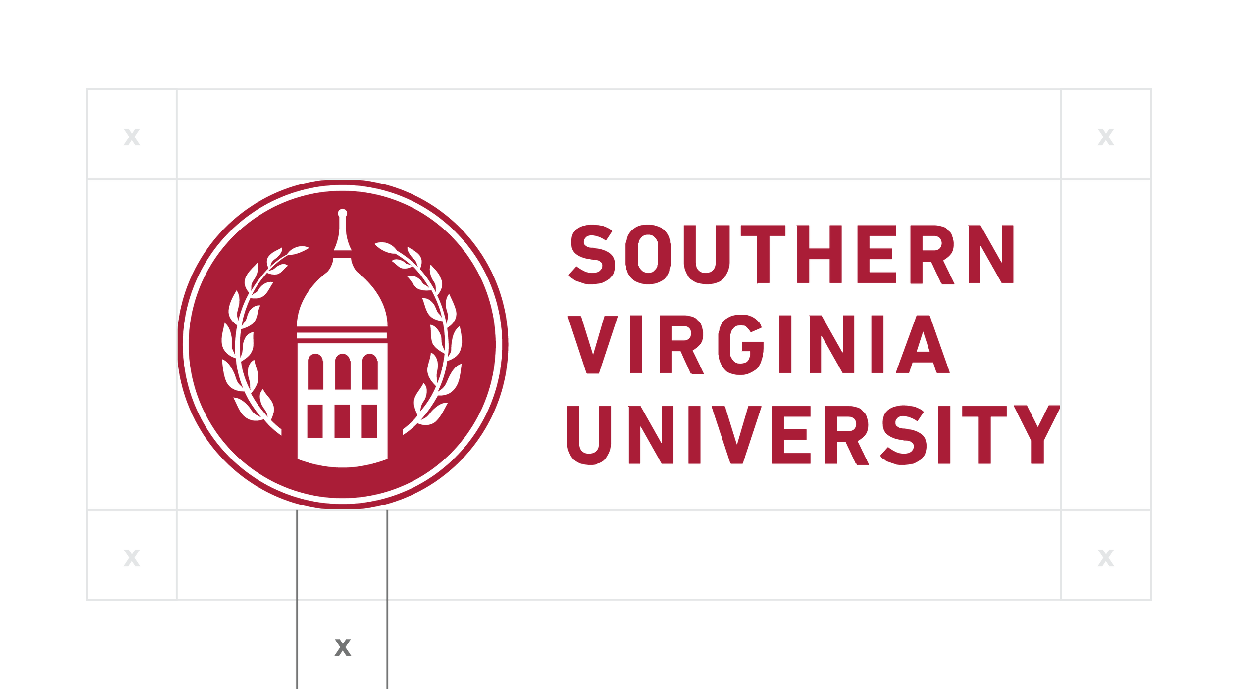
The Primary Logo consists of the Tower Logo and Southern Virginia University Wordmark. The arrangement, orientation, proportions, or spacing of the logo and wordmark should not be altered.
Color Combinations
White and Crimson are the primary colors and should be used most often. Crimson may also be used on silver, or white on black or anthracite. Crimson should not be used on black or anthracite and vice-versa without express permission from the Brand & Creative Office.
Scaling
The logo should be well balanced and in proportion — not too large or too small on the page or screen.
Recommended minimum size is 30 pixels for screen, and .25 inches in print.
Clear Space
Don’t crowd the logo. When placing other elements nearby, ensure minimum clear space for brand consistency.
Clear space can be measured using the width of the tower logo. See example below.

Alternate Logos
The Tower Logo may be used without the Wordmark as a quick university identifier on social media accounts, email signatures, campus signage, etc.
Souther Virginia University’s seal is used primarily for formal academic purposes like certificates and official documents. The seal may also be used on clothing or other selected items with express permission from the Branding & Creative Office.
Tower Logo
Academic Seal
Athletic Logos
Knights have a rich tradition of chivalry, courage, service, and valor; these ideals perfectly align with the principles and values of our university. The Knight Logo is designed to represent these values.
Knight Logo (One Color)
Knight Logo (Two Color)
Shield Logo
The Knight Logo and Shield Logo are Southern Virginia University’s athletic logos. The “Knights” and “University” versions are for general use. The Shield Logo may be customized for individual teams (see Athletic Sub Brands below).
Knights Shield
University Shield
Athletic Sub Brands
The Shield Logo may be customized for individual athletic teams.
Selection of Athletic Sub Brands
Don’ts
Do not diminish the value of the logo by applying treatments. See the below sample of treatments to avoid.

Don’t stretch

Don’t outline

Don’t use unapproved colors

Don’t apply shadows or effects

Don’t rotate

Don’t apply patterns
TYPOGRAPHY
Sans Serif
Söhne is a sans-serif typeface designed by Kris Sowersby and published through Klim Type Foundry in 2019. It’s described by Sowersby as “the memory of Akzidenz-Grotesk framed through the reality of Helvetica.”
Söhne is used in both digital and print.
Söhne
Klim Type Foundry
ABCDEFGHIJKLM
NOPQRSTUVWXYZ
abcdefghijklm
nopqrstuvwxyz
0123456789
Weights
Type weight provides hierarchy to distinguish between pieces of information.
Söhne Buch and Halbfett
You belong here.
You belong here.
Serif
Signifier is a serif-style font designed by Kris Sowersby and published through Klim Type Foundry in 2020. It is described by Kris as a “Brutalist response to 17th century typefaces.”
Signifier is used in both digital and print.
Signifier
Klim Type Foundry
ABCDEFGHIJKLM
NOPQRSTUVWXYZ
abcdefghijklm
nopqrstuvwxyz
0123456789
Weights
Type weight provides hierarchy to distinguish between pieces of information.
Signifier Extralight and Light
You belong here.
You belong here.
COLOR
Primary Palette
Crimson, White, and Silver are the primary colors of Southern Virginia University.
Crimson is the most recognizable color of our unique campus architecture. For medieval knights, this deep red color symbolized victory, while white symbolized the ideals of perfection and purity.
Silver conjures imagery of a knight’s shining armor. Historically, gray or silver symbolized balance and justice. Today, the color represents modernity, solidity, and strength.
Athletic uniforms should only use the University’s primary colors.
Crimson
- CMYK: 0/100/65/34
- RGB: 158/27/50
- HEX: #9e1b32
- PMS: 201 C
White
- CMYK: 0/0/0/0
- RGB: 255/255/255
- HEX: #ffffff
Silver
- CMYK: 40/31/32/0
- RGB: 160/161/162
- HEX: #A0A1A2
- PMS: 422 C
Alternate Colors
Because Crimson is difficult to see on dark colors, they should be used sparingly. Anthracite and black are to be used only for coaches or player gear, but not on uniforms.
Black
- CMYK: 0/0/0/100
- RGB: 0/0/0
- HEX: #000
Anthracite
- CMYK: 68/60/65/54
- RGB: 56/58/53
- HEX: #383A35
- PMS: 447 C
Secondary Palette
The secondary palette may be used to add variety and interest to designs that would benefit from more color. This palette is based on a Blue Ridge sunset.
Dark Blue Sunset
- CMYK: 100/33/0/64
- RGB: 0/61/91
- HEX: #003D5B
Medium Blue Sunset
- CMYK: 0/95/0/0
- RGB: 33/158/188
- HEX: #219EBC
Light Blue Sunset
- CMYK: 38/12/0/10
- RGB: 142/202/230
- HEX: #8ECAE6
Yellow Sunset
- CMYK: 0/28/99/0
- RGB: 255/183/3
- HEX: #FFB703
Orange Sunset
- CMYK: 0/47/100/2
- RGB: 251/133/0
- HEX: #FB8500
Medium Red Sunset
- CMYK: 0/81/76/6
- RGB: 240/45/58
- HEX: #F02D3A
Dark Red Sunset
- CMYK: 0/83/68/38
- RGB: 158/27/50
- HEX: #9E1B32
Downloads
For any questions about using these guidelines, please contact:
brand@svu.edu